Shaverhut rebrand
Shaverhut is an online brand selling shaving and grooming needs since 2006. It focuses on great customer service, fast shipping and a wide range of brands.
RE-BRAND
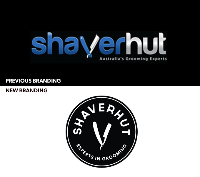
I was approached to rebrand shaverhut to broaden its appeal, target hipsters with facial hair and make it feel more expensive. Although there was nothing particularly bad about the previous shaverhut branding, the owner felt it was not representative of where they wanted the store to be – it blended in rather than standing out.
WEBSITE
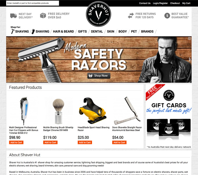
I was tasked with restyling the website to suit the new branding. With a predominately male target audience, black and a suite of greys was chosen for the brand – with a focus on texture, bricks and wood for its key component; the website.
Since the redesign the company has sold significantly more luxury items and in the words of the owner/client “Definitely has taken it to another class :)”
PRINTED MATERIAL
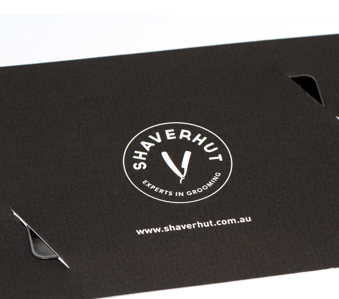
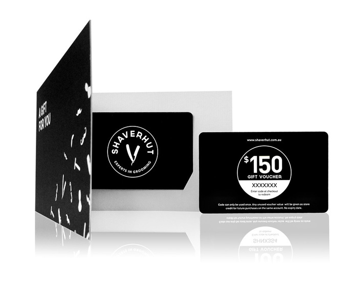
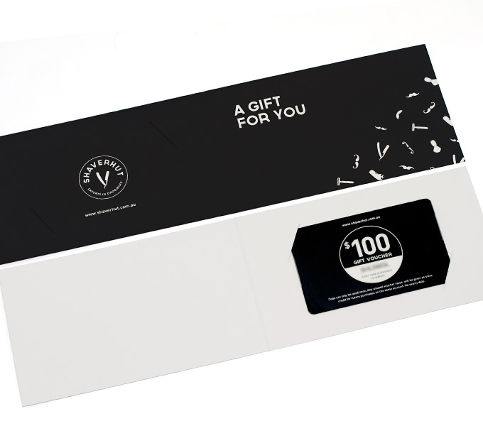
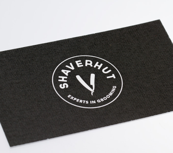
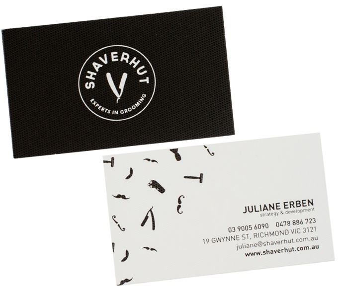
Feeling expensive was the focus for the printed material – with heavy uncoated papers and rich black ink. A repeatable pattern created for branded tissue paper (to wrap web-store purchases in) was used throughout.
ClientShaverhutSkillsbranding, printYear2013
