Queen B candles
Queen B is a sydney based candle company which makes their range of candles by hand with Australian Beeswax and no additives.
RE-BRANDING
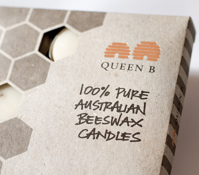
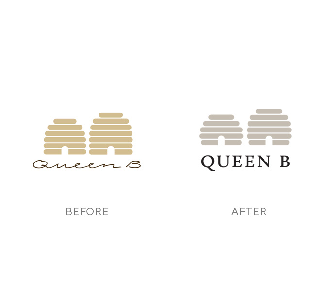
After 12 years with their initial branding, Queen B approached me to refresh their brand so that it came into line with the companies ideals whilst also feeling more modern. Eager to retain the recognisable elements of brand, the logo was only given a minor update. Simplified beehives and a more legible logotype made things feel fresh and coupled with new branding elements – hexagons and bee stripes – the brand was given a new life.
To accompany the new patterns – bee stripes and hexagon tiling – two fonts were chosen to represent all content. The one font, which is hand-drawn by Joost Bakker, a close friend of the owner, used sparingly for maxiumum impact, is used for the primary brand marketing points on the front and side of the packaging. To support this a more refined sans-serif – AW Conqueror Sans – was used for all addition information.
PACKAGING
Packaging featured on thedieline.com in May 2013
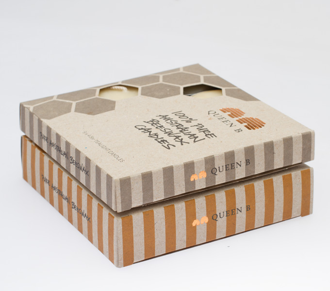
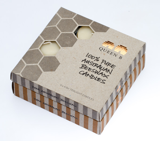
With a focus on pure, natural goodness with the Queen B products, the packaging was given the same focus. Australian made 100% recycled stock, soy based pantone inks and recycled foil all gave the packaging an organic handmade feel.
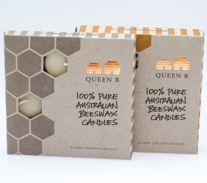
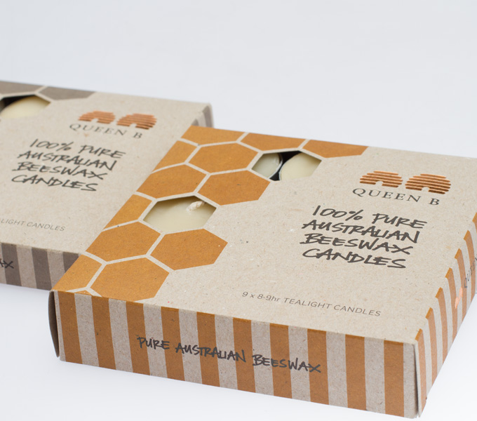
The first product to be refreshed was the 2 varieties of tealight candles. The natural aroma of the candles is one of their key features, so hexagon shaped cutouts were placed to allow customers to smell the product (and see it) easily.
The colour palette was kept muted and natural within the spectrum of nature, the australian bush and honey. Two different colours were chosen to easily distinguish between the two different products in the tealight range.
ClientQUEEN BSkillspackaging, printYear2013
