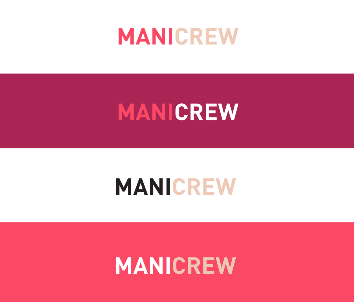
MANICREW
Manicrew is a Melbourne and Sydney based brand providing 15 minute in office manicures to large companies.
BRANDING
I had so much fun working on this branding. Being a lady in design surprisingly hasn’t presented too many opportunities to go super feminine on any project, but a nail based brand with key words like “high gloss, upbeat, professional, fun” certainly called for super feminine – yay!
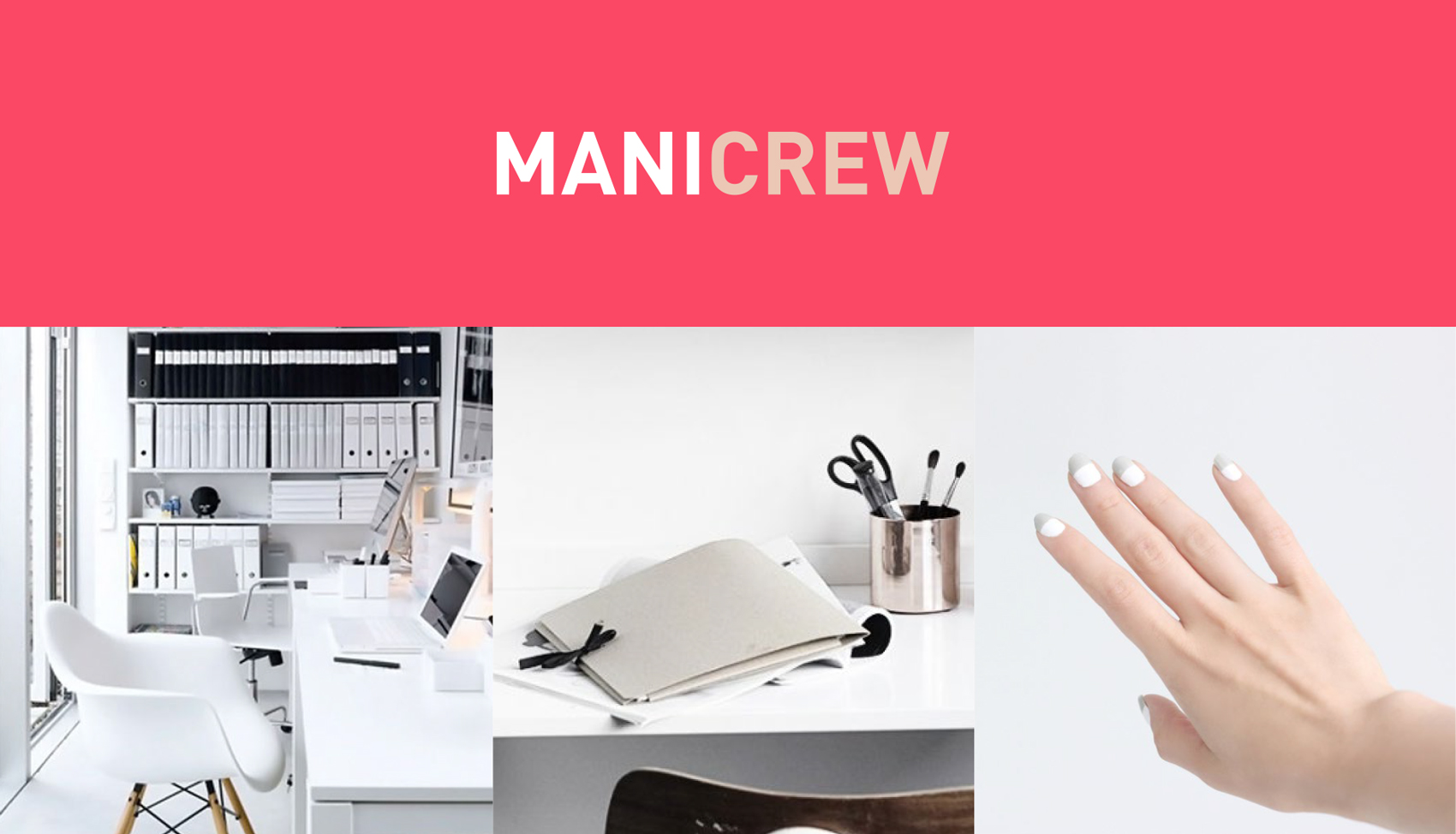
Given that the brand is aimed at the corporate world, it also had to retain a professional polish (lol, puns!), which is fine by me because I didn’t want to go for the cheesy world of nail shaped logos and hands in awkward poses (and neither did the clients).
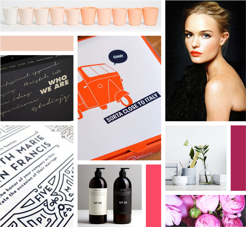
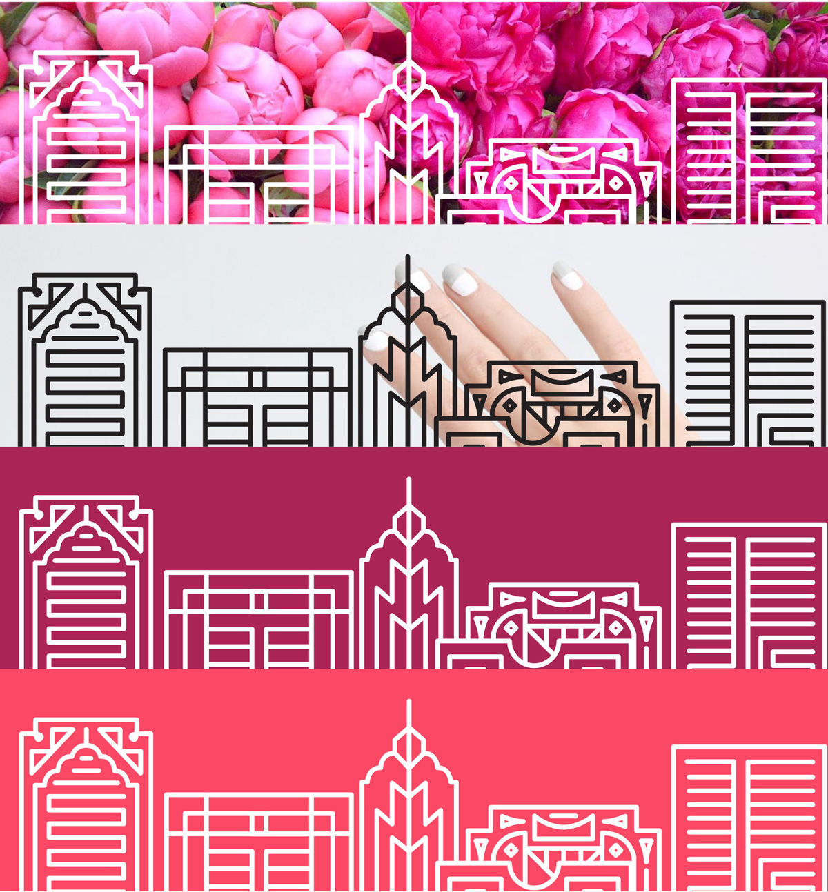
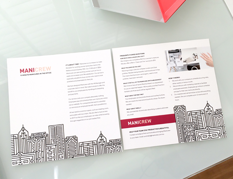
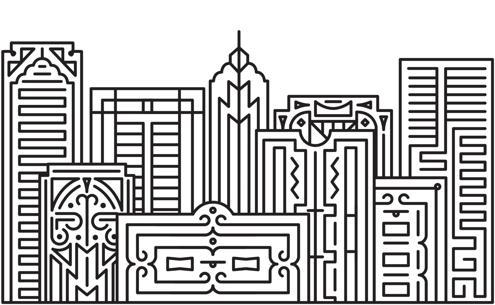
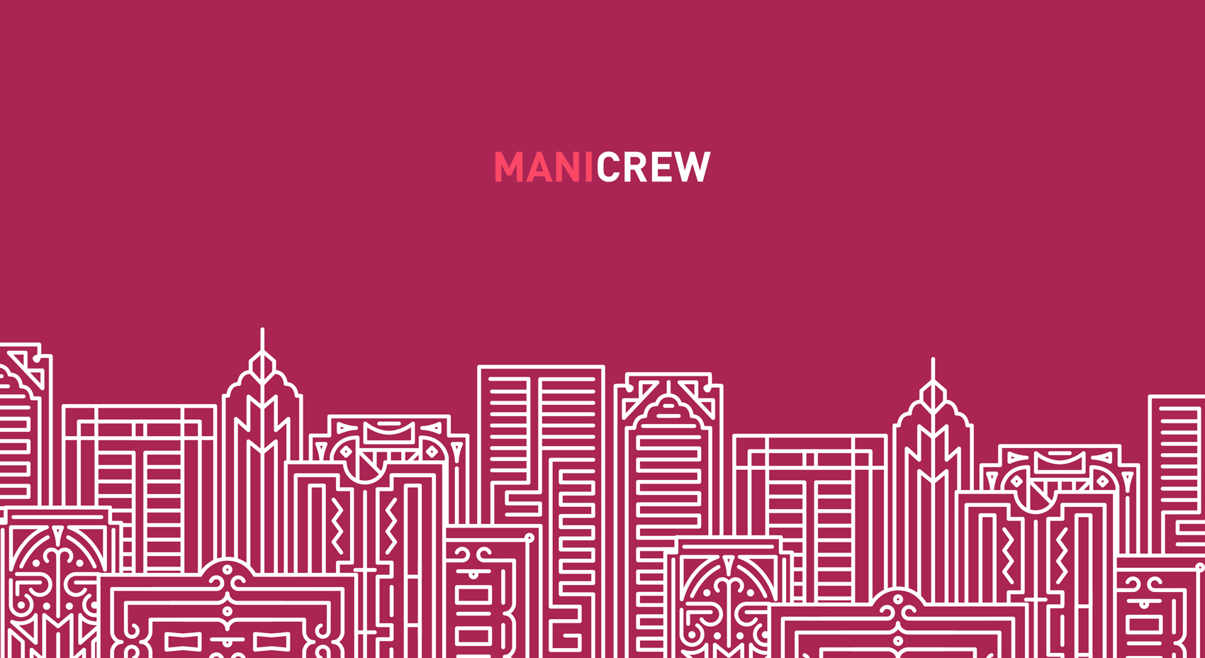
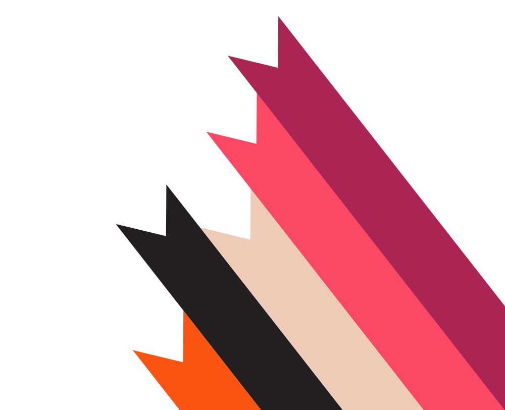
After some brainstorming, I decided to present a brand that was bold with slight 1920s influences (sophisticated, metropolitan, timeless), with a modern twist (bright colours, innovation, professional) and a cheeky personality (fun, upbeat). This in the end amounted to a super bright colour palette made up of nail colours (but the modern iteration of each instead of the obvious), with stark corporate black and white and a super cool illustrated art deco style metropolis city skyline that can be used on a number of bright backgrounds or simply black for dramatic effect.
I am so chuffed with the result and the clients LOVE the brand. I can’t wait to work on more collateral for this one.
ClientMANICREWSkillsbranding, illustration, printYear2014
