dogify
Dogify.com.au is a Melbourne based webstore launched in 2013, that specialises in premium dog products and dog grooming.
BRANDING
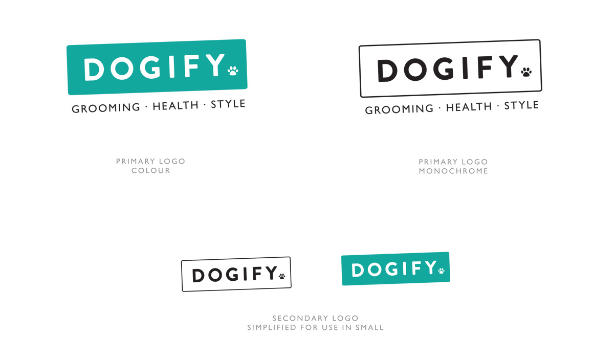
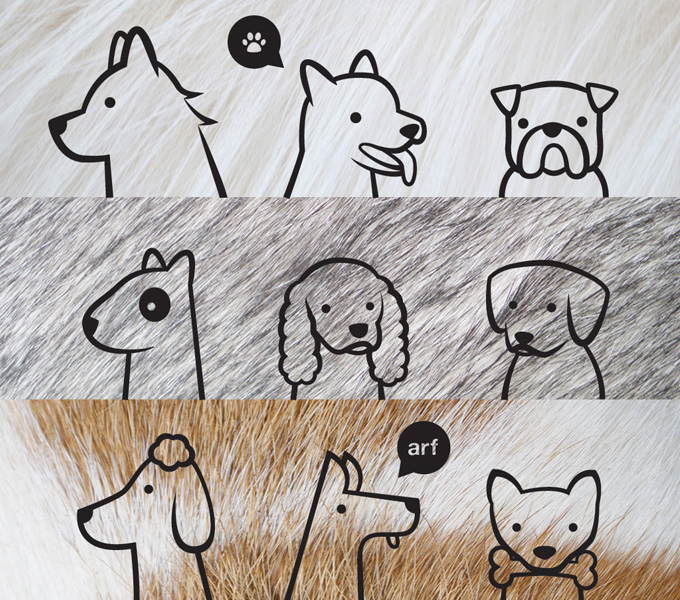
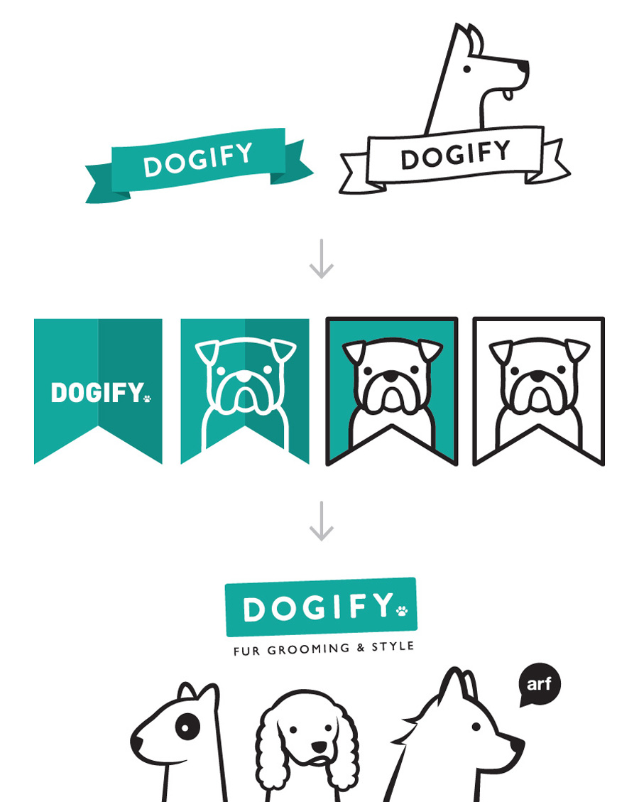
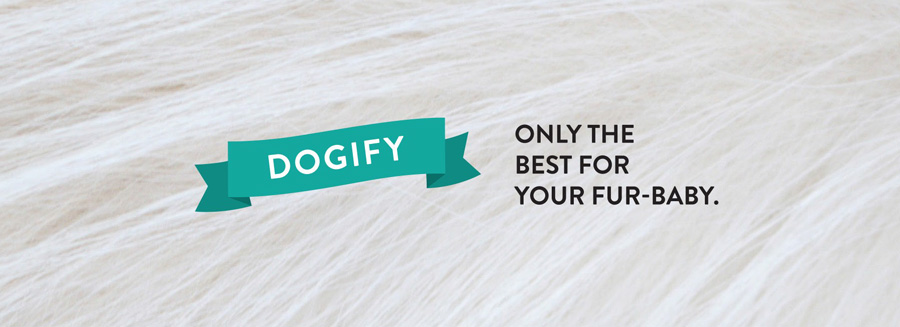
Given the brand was aimed at dog loving, urban women between 25 and 35, a fun but stylish approach was taken. The brand involved many elements and textures, to make the touchpoint of the brand more interesting. The logo went through a few different versions of banners before arriving at its final form of a rounded box, but the more character filled elements of the brand were a set of dog caricatures. With 9 in total the black line drawings of dog heads add a playful side to otherwise corporate brand. They were made intentionally nondescript so that site users would see ‘their’ dog in one or more of them. These in conjunction with fur macro backgrounds establish a complete brand. A colour palette of teals was chosen to represent the brand as it was an unusual one in the pet market (which is heavily dominated by blue and red) – the colour also contrast well with most fur colours. An added bonus was that the colour was feminine without being so hyper-fem that it alienated potential male shoppers.
WEBSITE
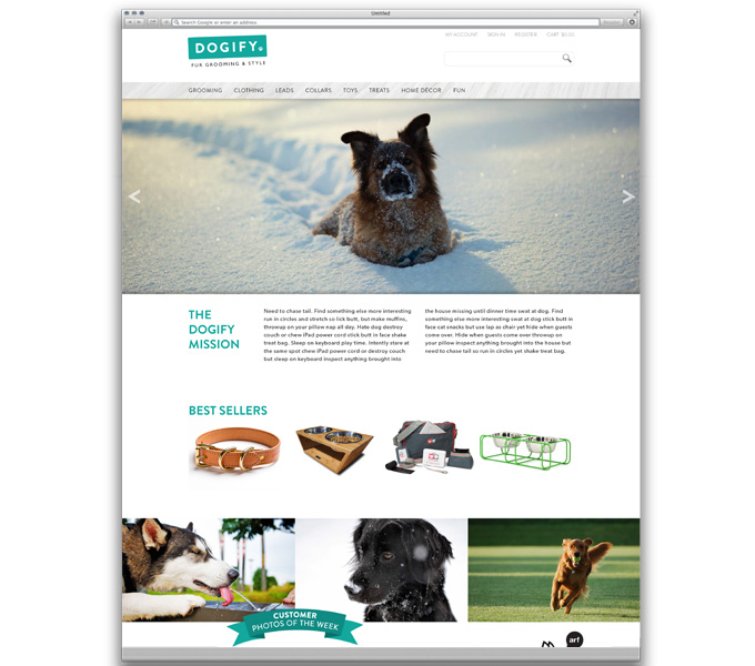
The primary touch point of the brand, the websites focus in design was usability and a modern look focusing on directing users to buy products. All brand elements were used throughout the site as well as a big focus on big, high quality photos of dogs.
I provided design direction for the site, but the functioning version was implemented by dogify internally – visit dogify.com.au
ILLUSTRATIONS
To make the brand feel more premium and give it a unique feel to other websites as couple of sets of illustrations were created for the website in addition to the branding elements.
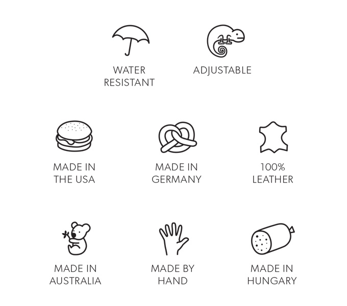
The first of these was a set of small icons to communicate key points about products – at first glance they appear straightforward and standard, but they are really good fun at heart, with a giant pretzel for german products and (my personal favourite) the chameleon for adjustable products.
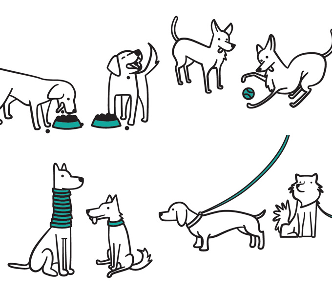
The second set was intended for the category pages of the site (but are yet to be implemented by the team). They are fun little cartoon drawings of dogs using the products for which they represent. The goal was to have the dogs looking a little manic and funny looking, to stop the whole thing feeling too serious. Shown here are 4 of the 7, clockwise from the top left: Bowls, Toys, Leads and Collars.
PRINTED MATERIAL
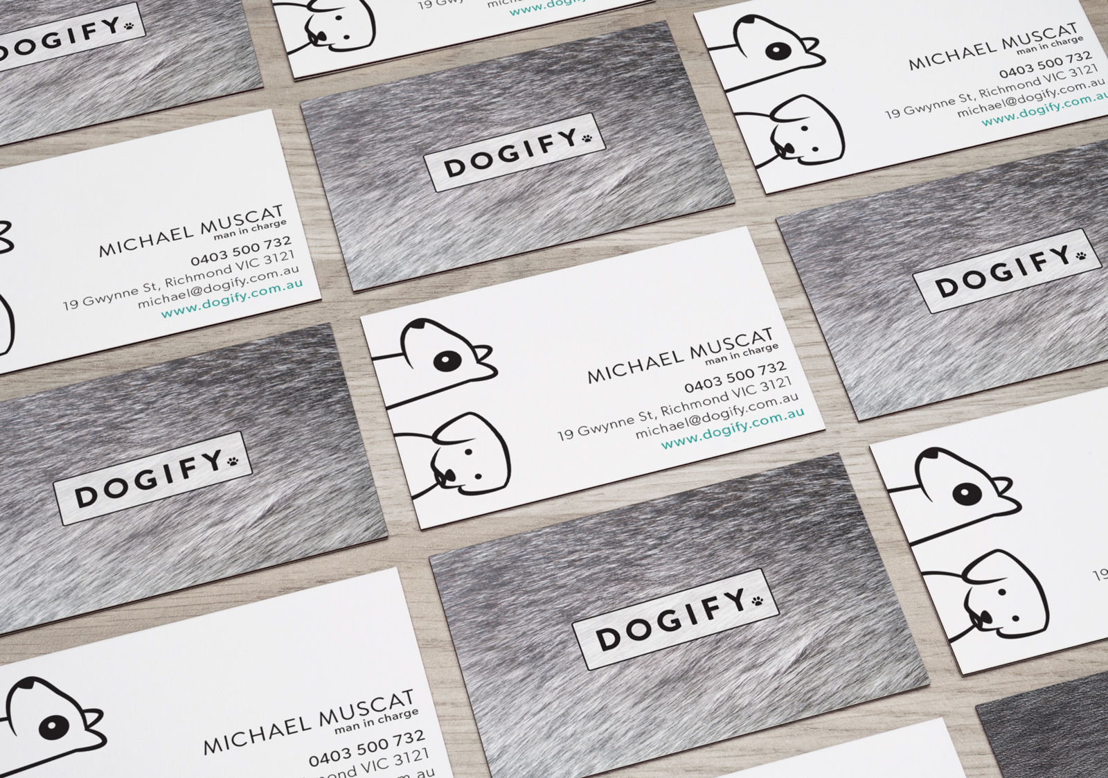
All printed collateral for the dogify brand combines all elements of the brand together. As with the other touchpoints of the brand, a premium feeling is always the aim. For the bands business cards, each person selected their favourite 2 brand mascot dogs to be on their card – representing their personality and preference in dogs – a fun point of difference when all the cards are together.
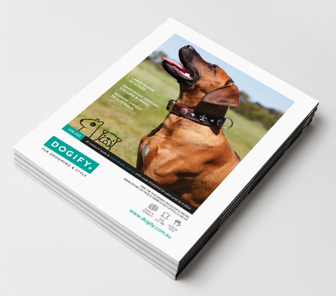
The printed advert also combines the brand elements along with the website product icons.
ANIMATION
I realise that I have great connection with brands I work on when a brief drops into my inbox for a job that I get really excited about. While this description really applies to everything I have done for dogify, I got especially excited when I was asked to create a couple of animated gifs for the dogify checkout process.
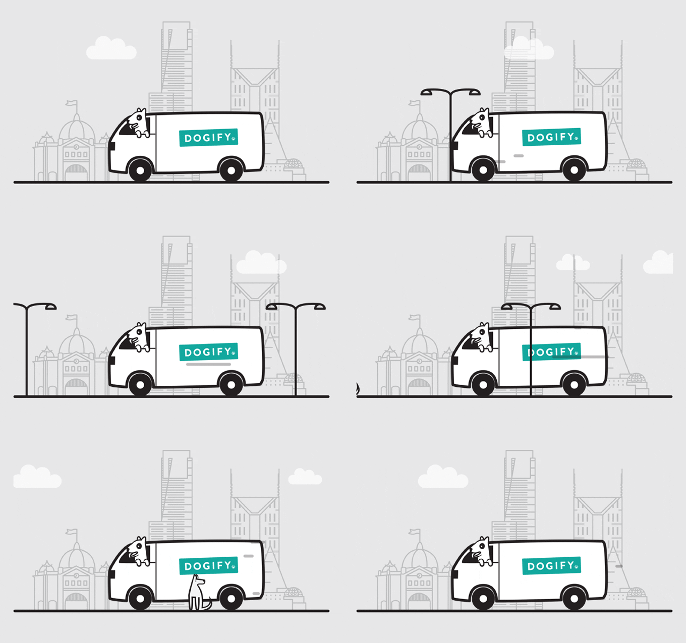
The first shown here is for when an order is dispatched – besides the obvious cuteness of the tongue wagging dog riding along in the delivery van, it also includes drawing of iconic Melbourne buildings in the background.
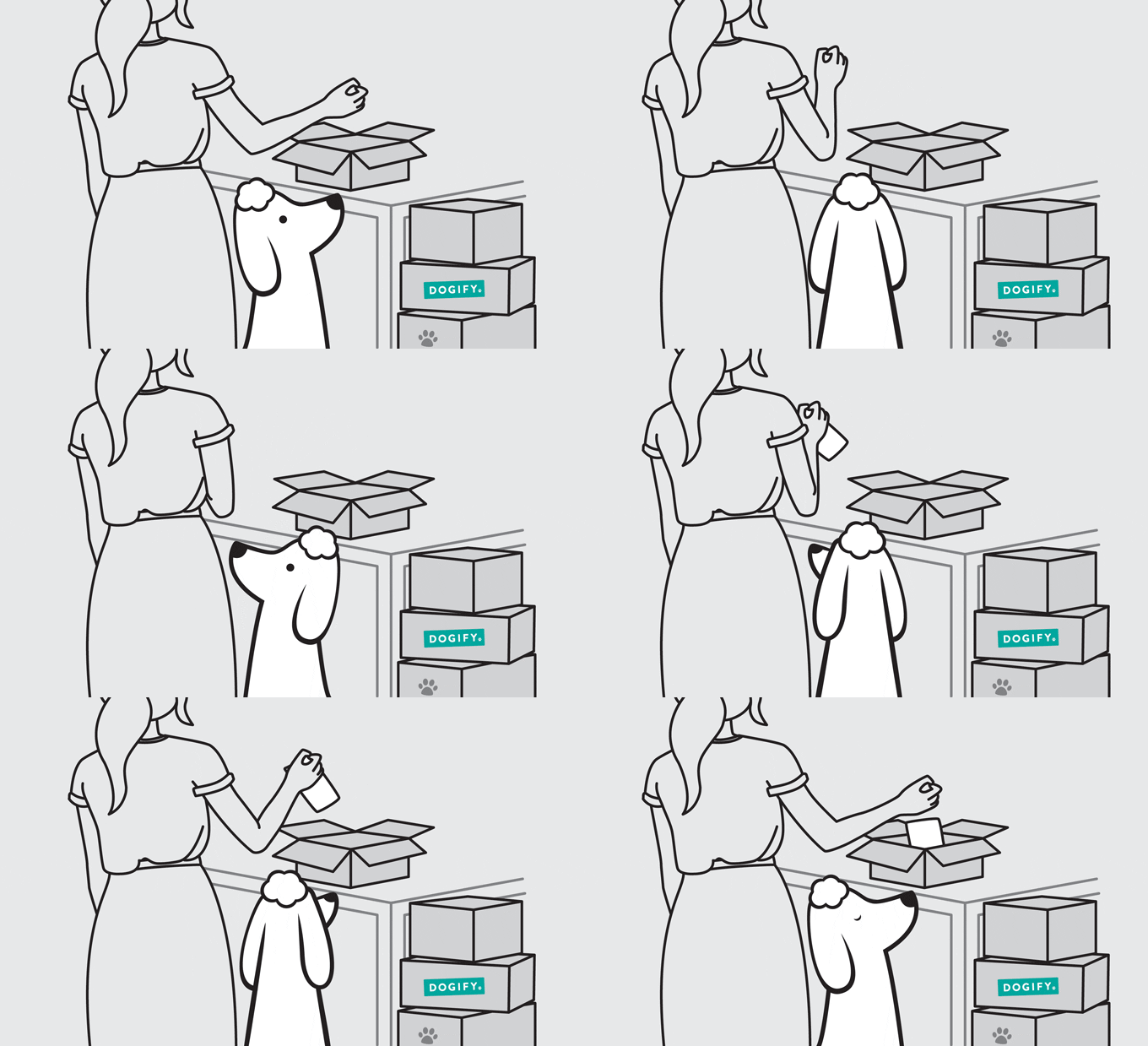
The second animation is for the order confirmation during checkout on the site – I particularly love the mesmerised dog watching the orders being packed.
ClientDogifySkillsbranding, illustration, web, print, motionYear2013
