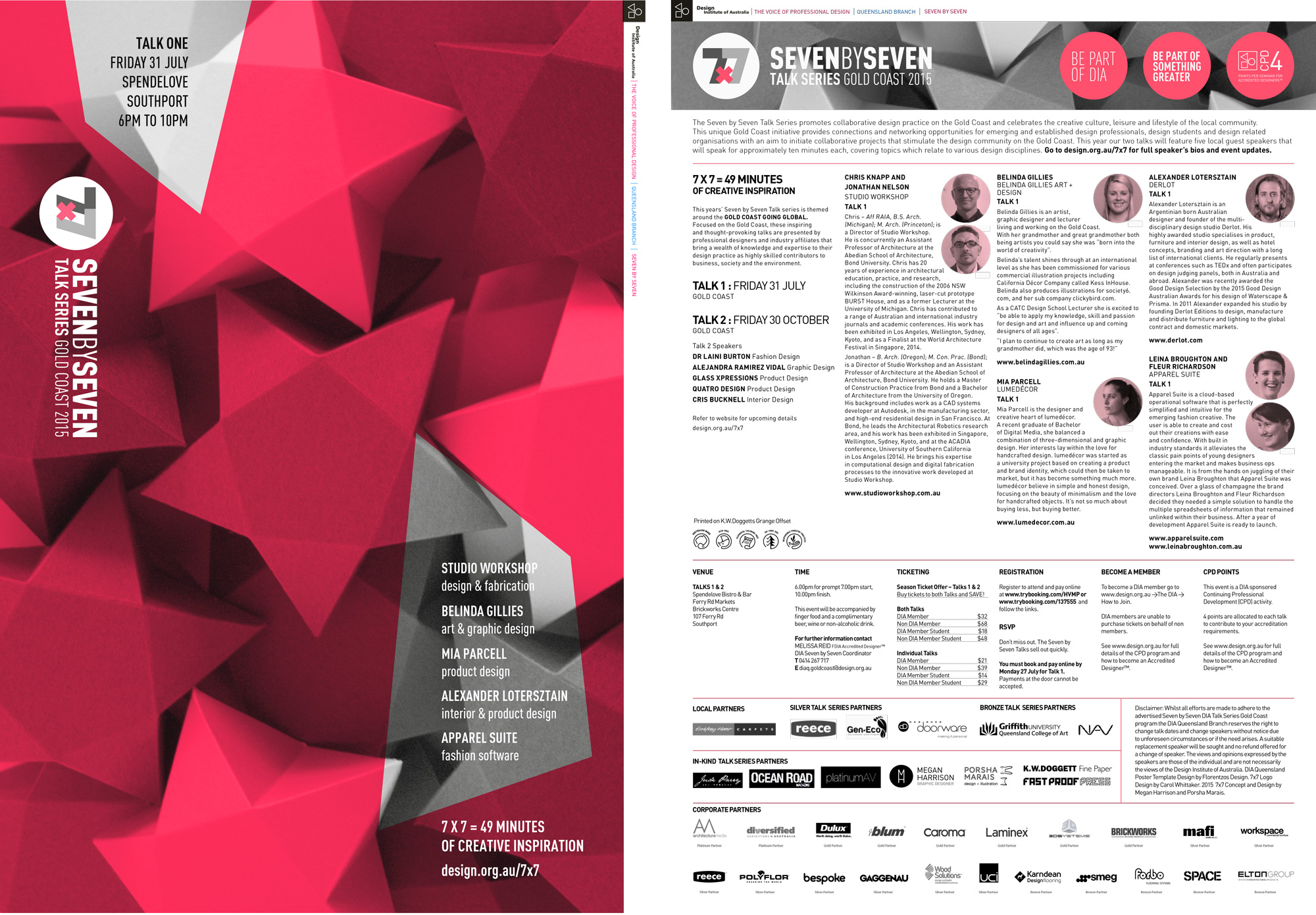
DIA 7×7 Talk Series 2015
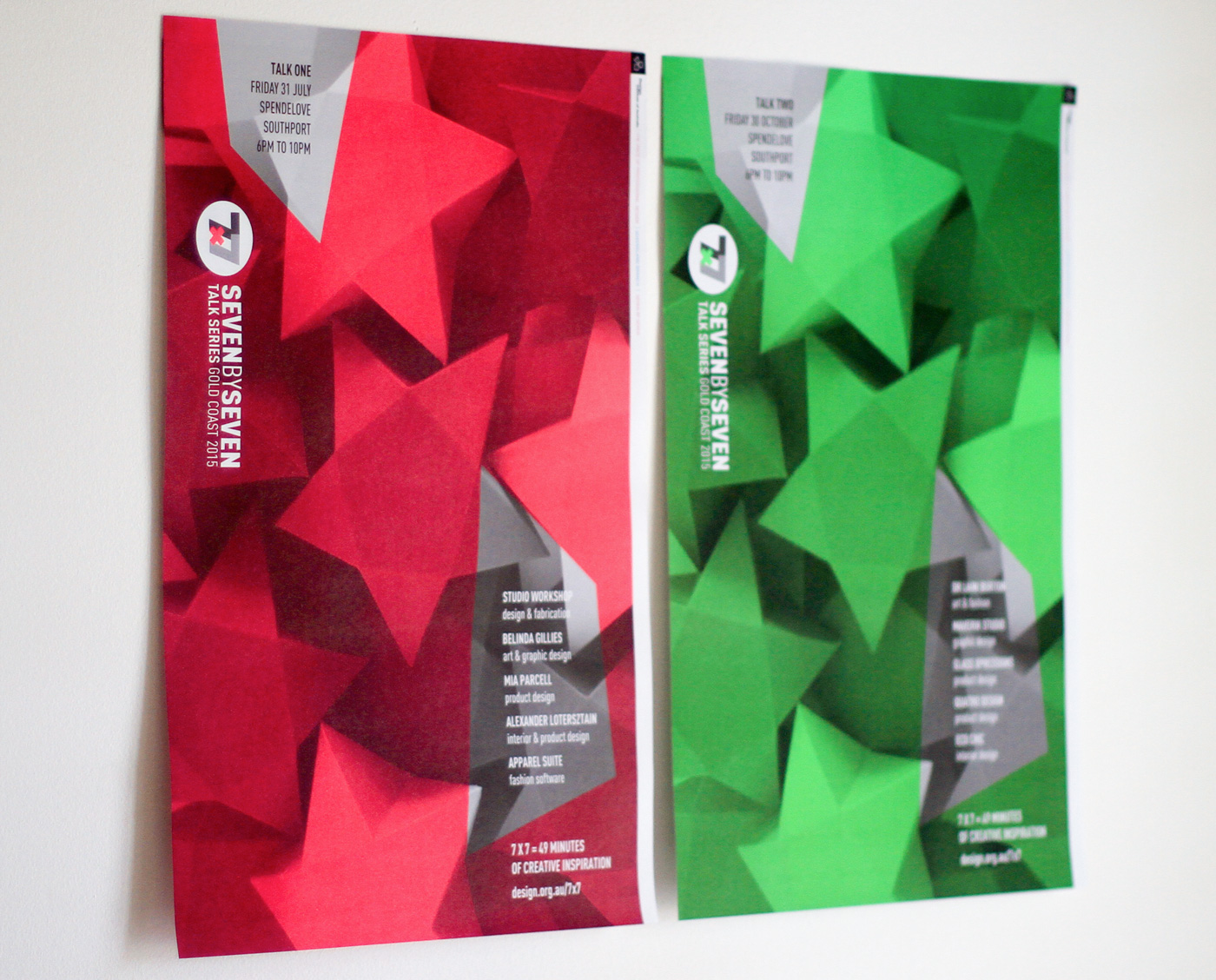
Talk 1: CMYK plus neon 812 U
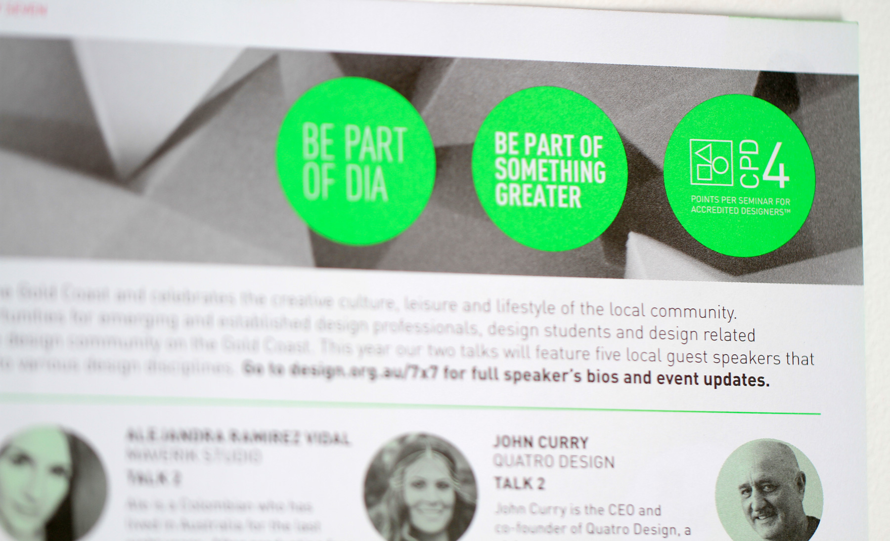
Talk 2: CMYK plus neon 802 U
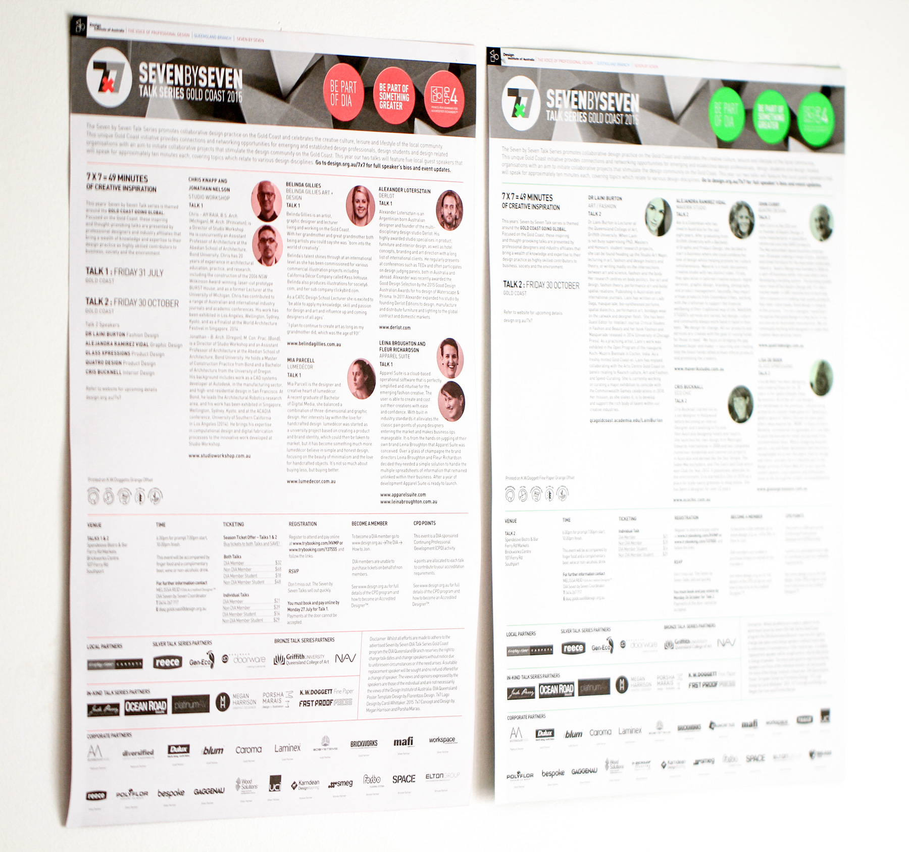
Printed on K.W. Doggetts Grange Offset
In 2015 I was invited to join the Gold Coast committee of the DIA to assist them with design material for their Talk Series event 7×7 which is run every year by the volunteers of the committee. In collaboration with Megan Harrison, I designed the look of the promo material and put together a series of two posters (plus a bunch of matching digital material) to promote the two talks.
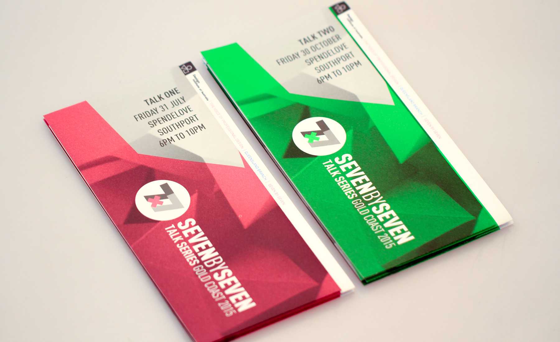
The scope of the project visually was up to Megan and I, we only needed to use the existing event logo and the format of an A2 poster with a very particular fold, but otherwise it was quite open. There needed to be 2 posters that matched, but looked unique to each talk.
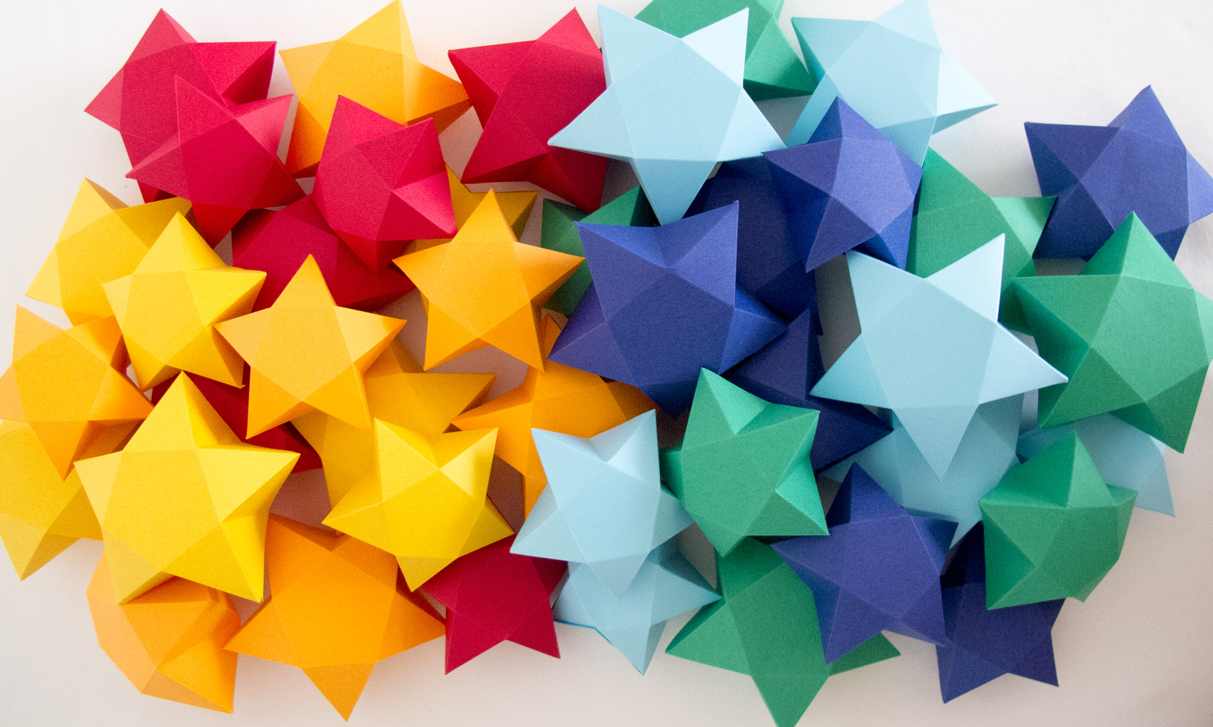
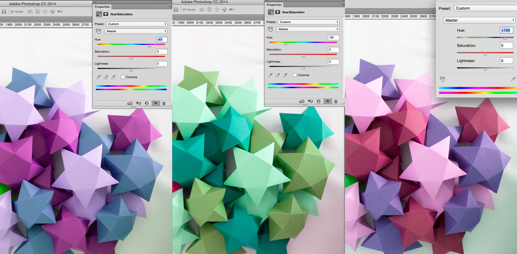
We both quickly decided that we wanted to make something real and photograph it, which seemed like a fun idea outside of our usual workflows. After some googling we stumbled upon a really cute star template and proceeded to make what felt like a billion stars each (actual number closer to 21 each). We used brightly coloured papers in warm tones and cool tones thinking this would end up being the printed colour scheme for the final posters, but when we got together to photograph our stars in a studio (Megan’s white living room with a sheet on the floor), our star folding efforts didn’t seem to be enough to create the images we hoped for. So instead of folding more stars (hell no), we decided to just have the stars larger on the posters and edit them digitally somehow. We were quite chuffed with the results we got from changing the hue of the photos and took designs with this to the committee.
As a throwaway line during the meeting we said something like “the most amazing thing we could do is print this with neon pantones, so that it punches the viewer in the face from across the room and demands their money to come to this talk” … to which we go much encouragement to ask the print sponsor if they would kindly print neons for us out of the generosity of their hearts. Much to our astonishment, FPP printers agreed to do this and the visuals changed quite quickly then from straight up CMYK stars to black overprint stars with a 100% neon base. Boom, this volunteer project suddenly got exciting.
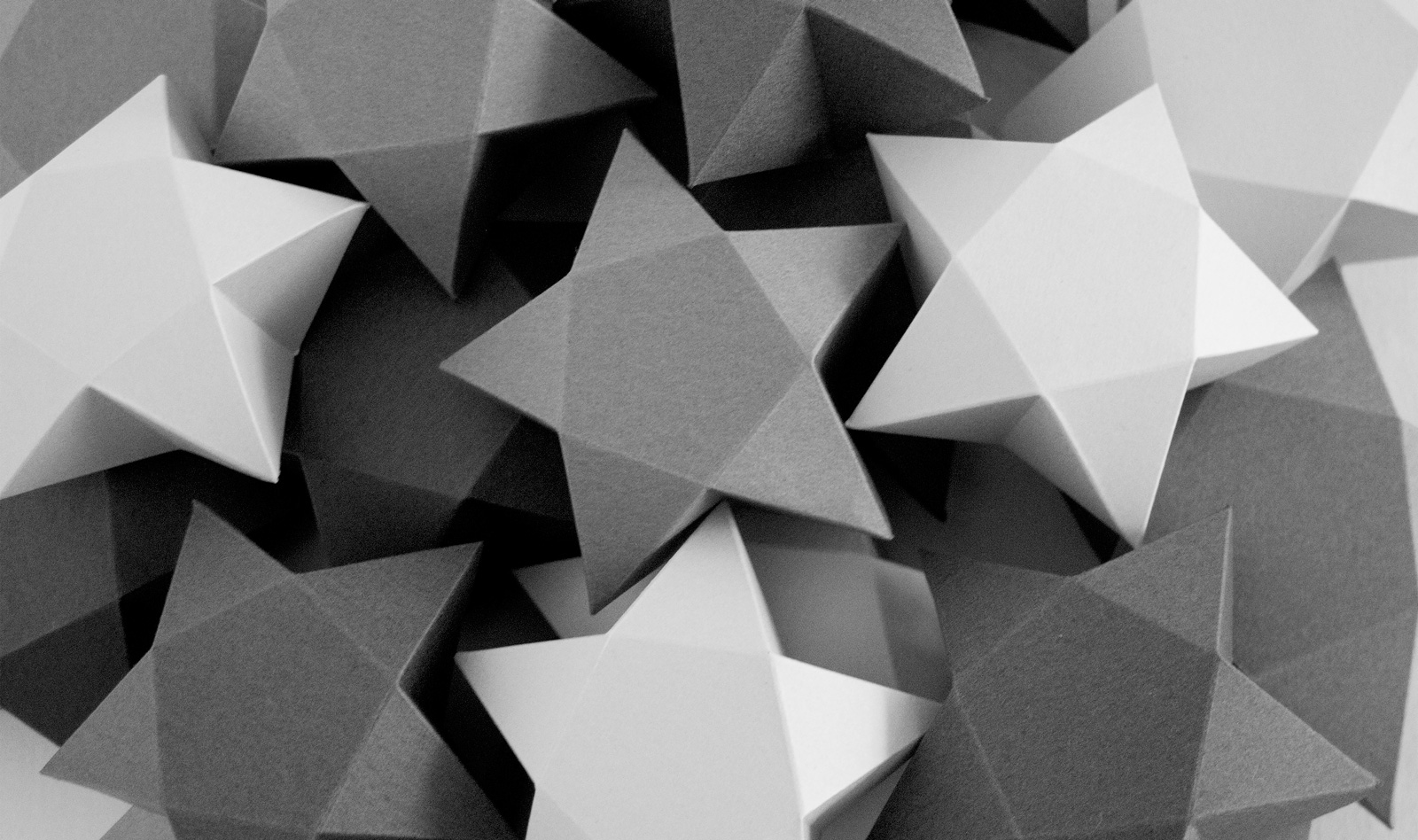
We decided to go with a gorgeous neon watermelon 812 and a radioactive green 802 for the two posters. We adjusted the star photo to be monochromatic, and went through many committee meetings of text adjustments and speaker co-ordination to arrive at the final designs.
ClientDIA 7x7 Talk Series 2015Skillsprint design (using 5th colour neon), being on a committee of volunteers, star foldingYear2015
