Craft Haus Beer Bundles
Craft Haus is in the business of beer hampers but we don’t want to use the word ‘hampers’ cause it makes people think of corporate gifts, little jams or David Jones at christmas time… so instead they’re in the business of ‘beer bundles’.
BRANDING
The client really wanted a mixture of loose freehand elements and more rigid ones, they brought in a bunch of inspiration they loved which all had Mexican cantina feels. The brand was ultimately aimed at women wanting something different to gift, so the look and feel needed to lean to the feminine side, but still be cheeky and fun.
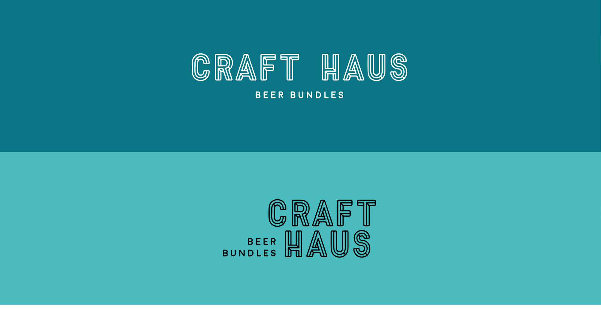
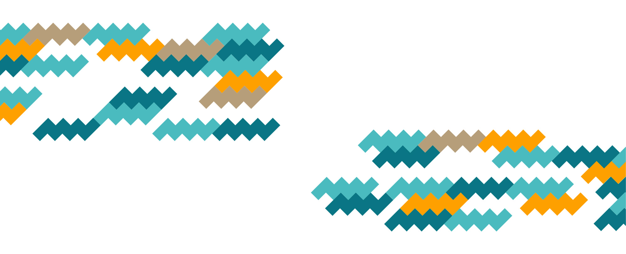
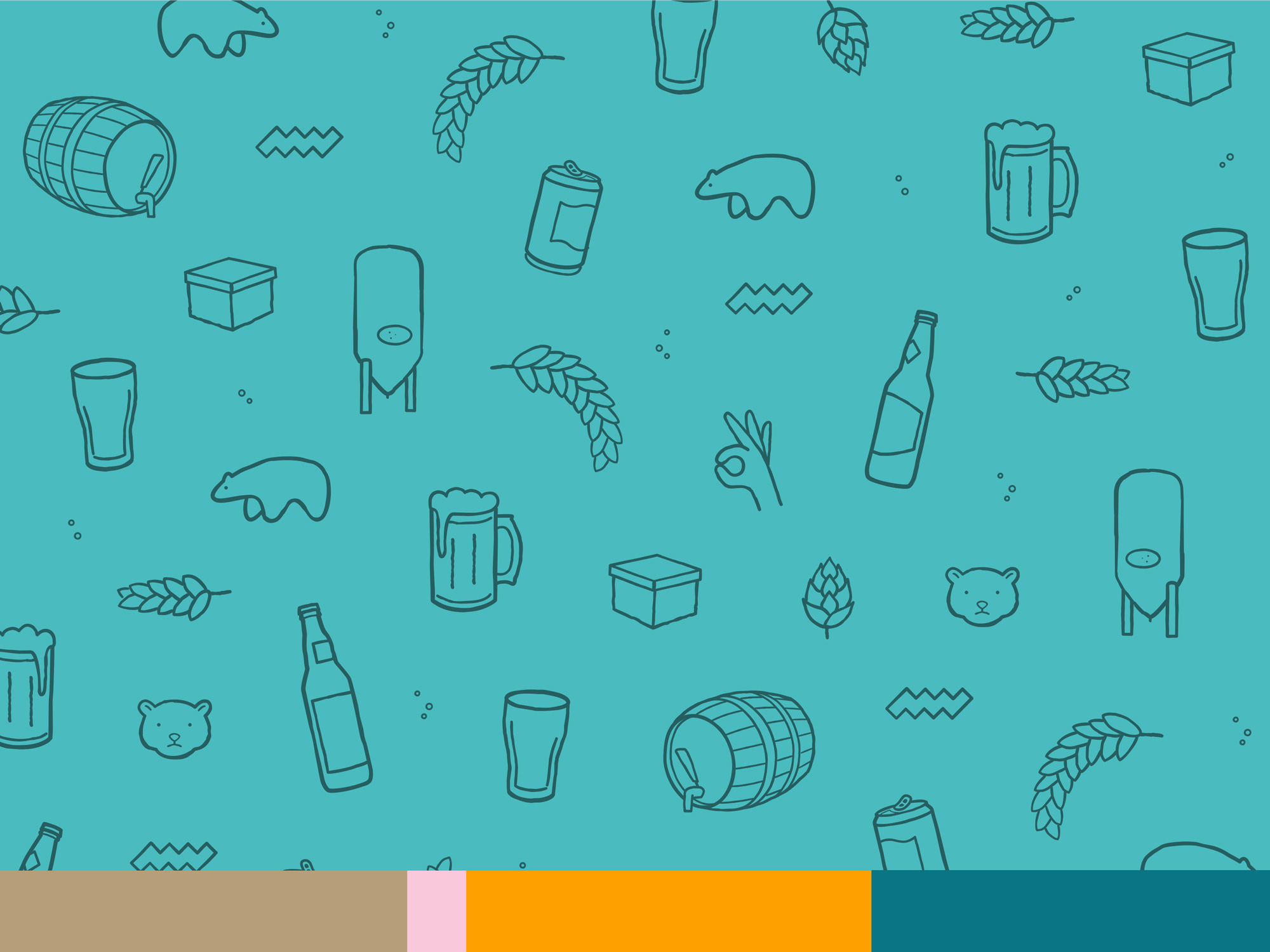
The logo brought in the bold lettering of the cantinas with a jigsaw situation referencing the ‘built’ component of the beer hampers and the colour palette of teals, orange, tan and baby pink brings a fun nod to the Mexican influences the client was after.
BEARS AND BEERS
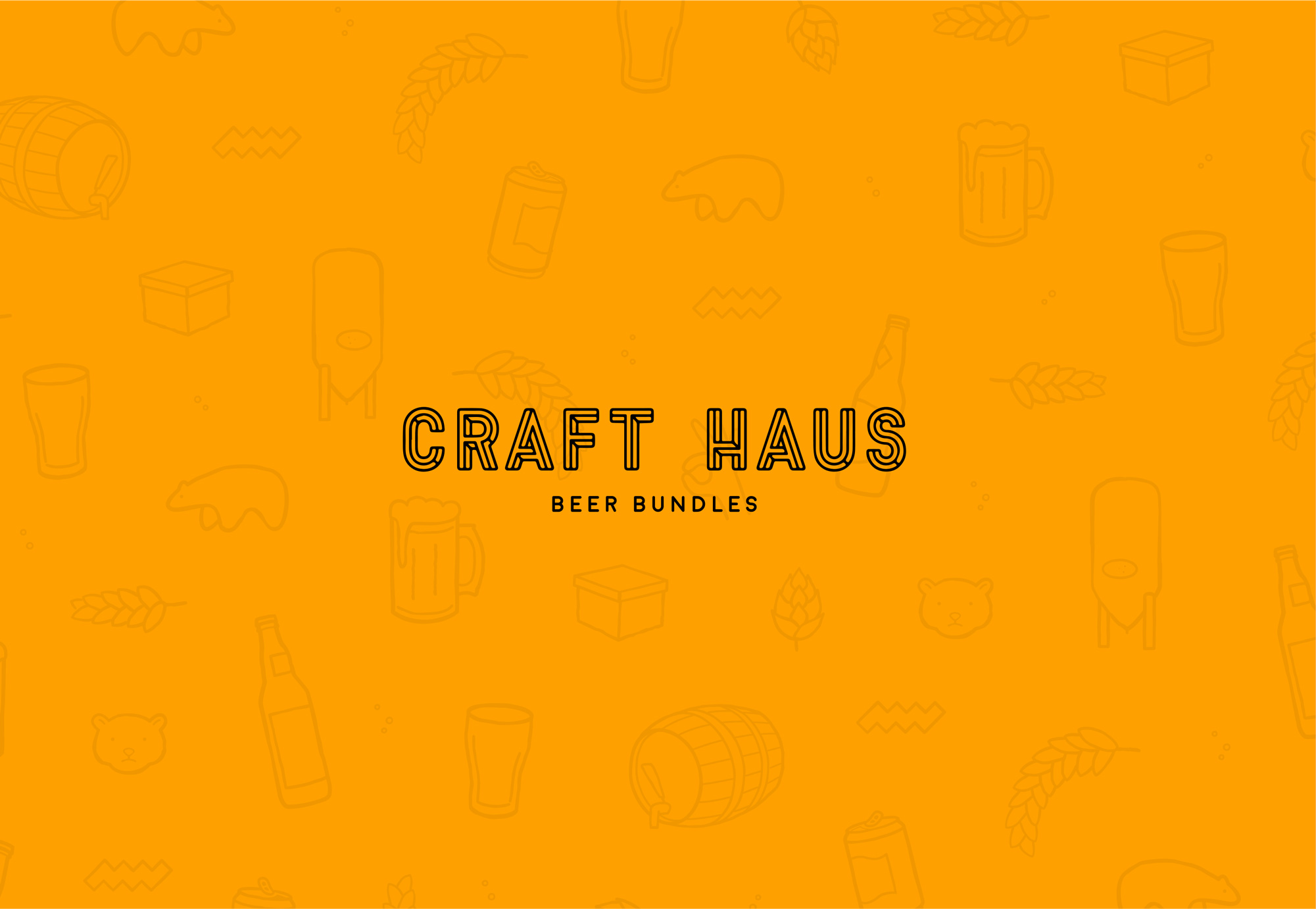
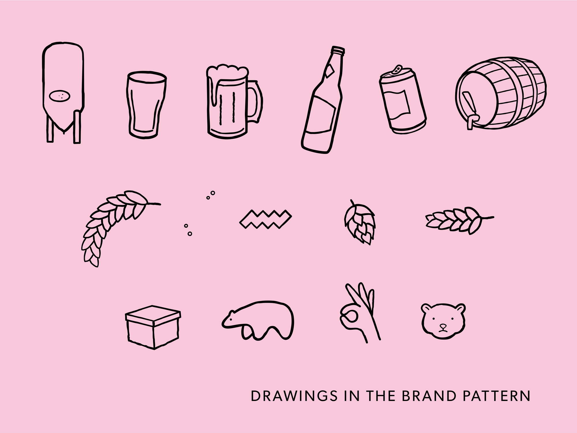
The visual elements of the brand – bears and beers – not just a fun alliteration, but a light hearted aspect to what is ultimately a fun company… one that gifts beer. A not too structured or perfect pattern comprised of sketchy rough drawings of beers, hops, wheat and beer paraphernalia, mixed in with bears… why, cause bears collect and cache their food (they’re making hampers!) … and they appeal to both genders without alienating either.
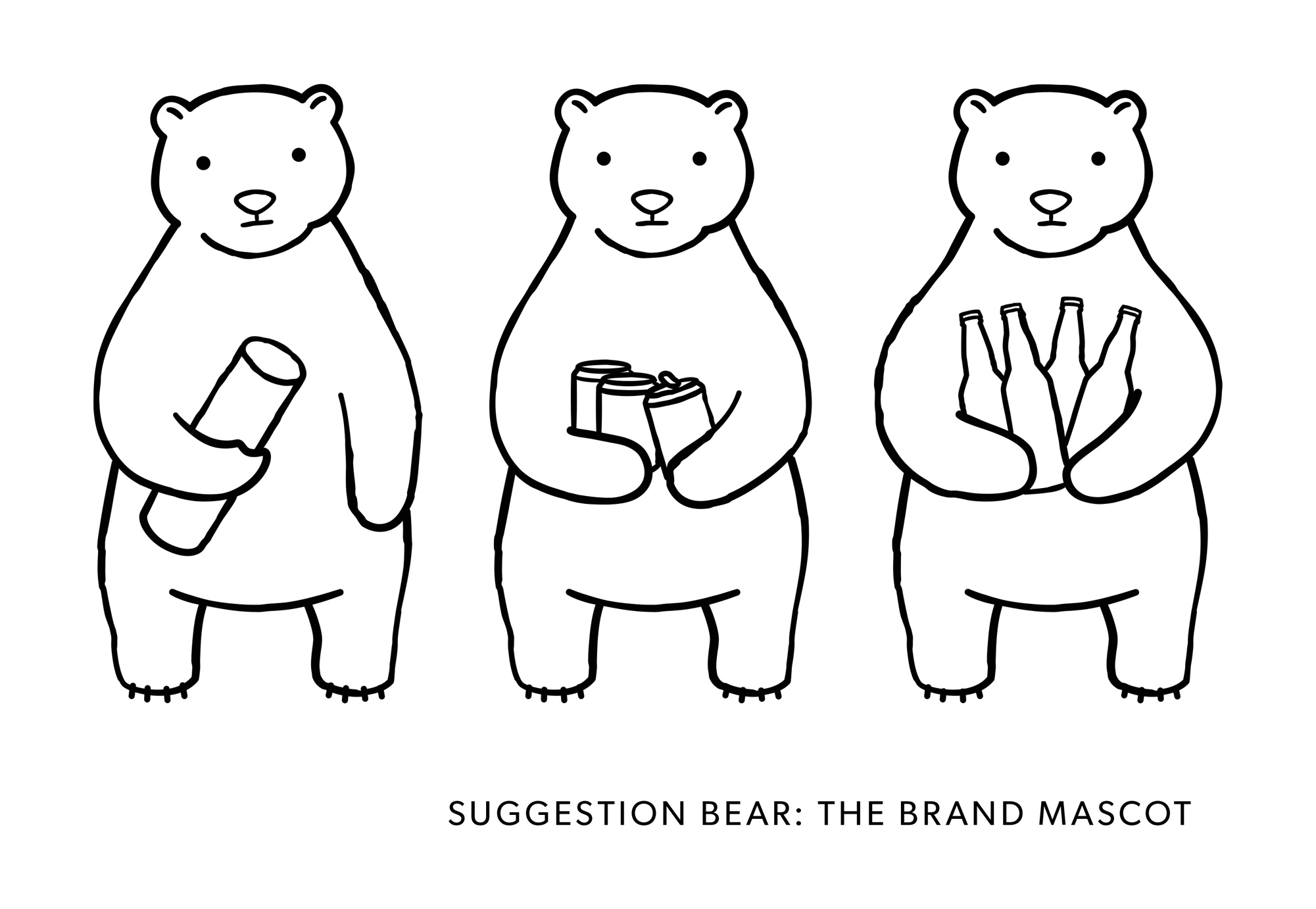
The brands mascot Suggestion bear, in the same visual style as the little sketches, is chilled and friendly with all the feels of modern gift giving. Suggestion bear makes neutral suggestions of gift combos for Craft Haus’ clients with his slightly desperate, optimistic face – an expression we can all relate to when it comes to gift giving for males.
ClientCraft HausSkillsbranding, illustrationYear2016
