Booty Australia
Wearing Booties and shaking booties. A brand refresh and website for Booty Australia.
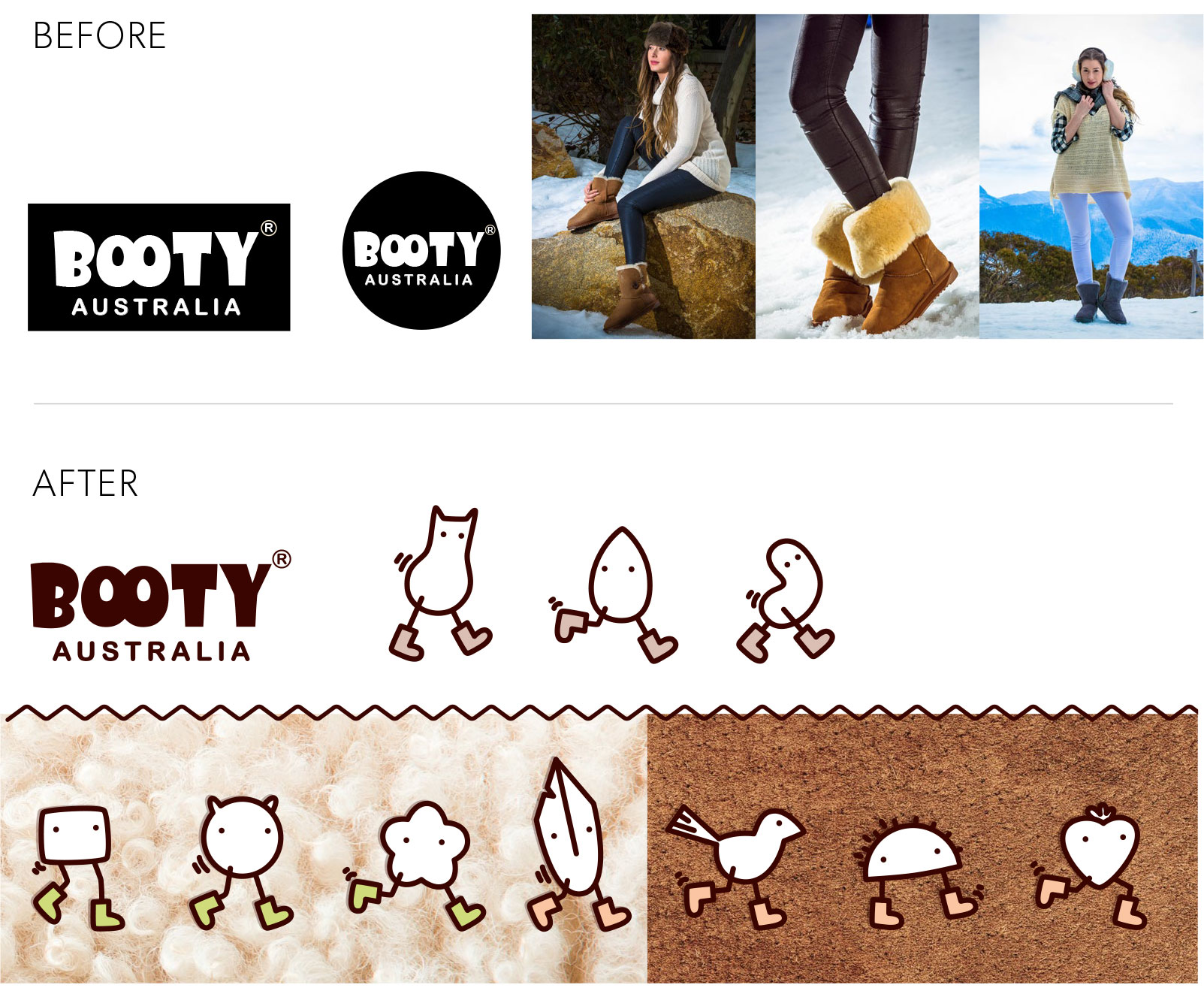
Booty Australia make high quality sheepskin boots and sell predominantly online and also in their Sydney Wooloomooloo store. The owner approached me to give his rudimentary site and brand a fresh new look to target women of all ages. The logo had to stay the same as it was embroidered into hundreds of pairs of boots – fair enough, its hard to argue with that. It was given a minor massage though – mostly on kerning.
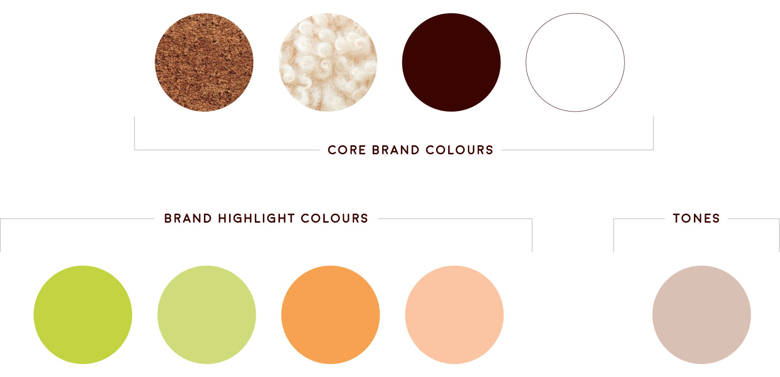
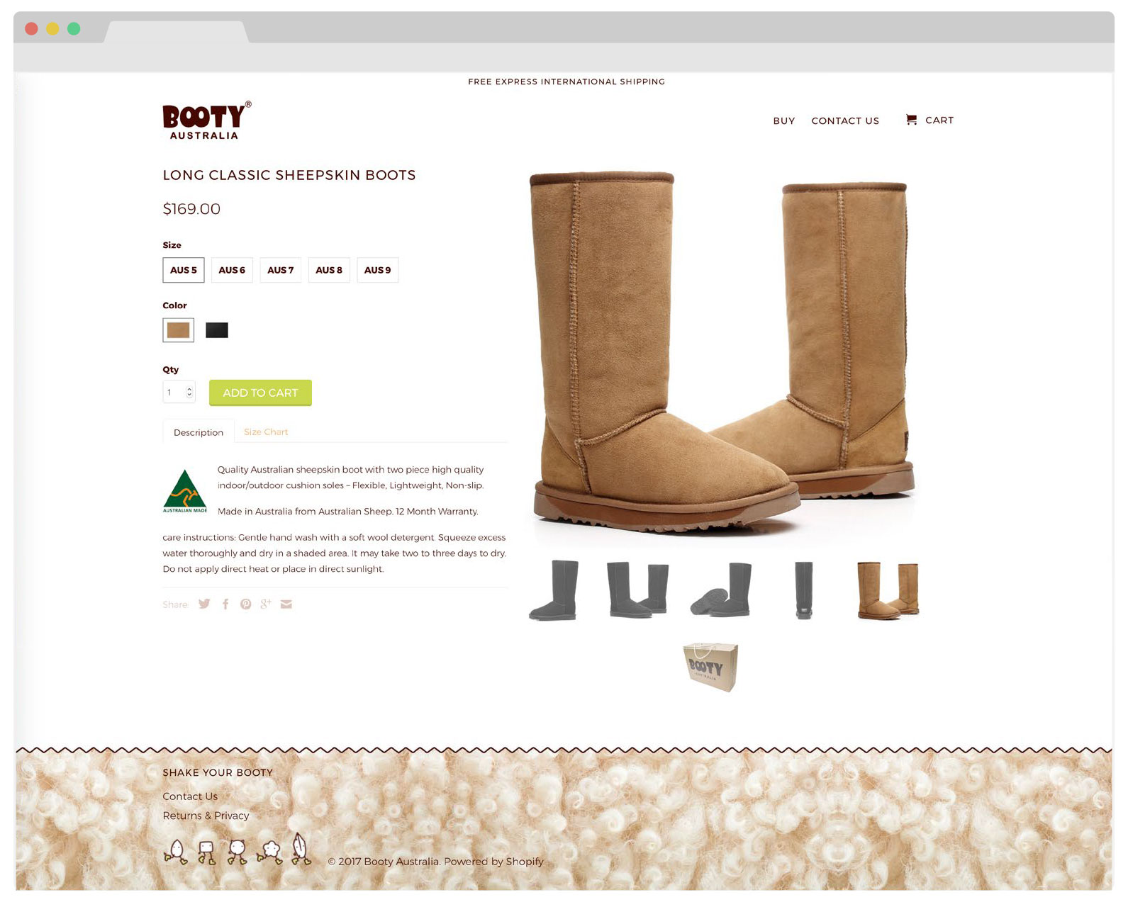
The client wanted something sexy, warm and healthy. A warm chocolate brown was chosen as the core colour with complementary colours of lime and tangerine. Most importantly high quality images of the textures of the materials used in the boots – suede leather and natural sheepskin – was integrated into the brand, giving it the warmth and natural appeal the client wanted.
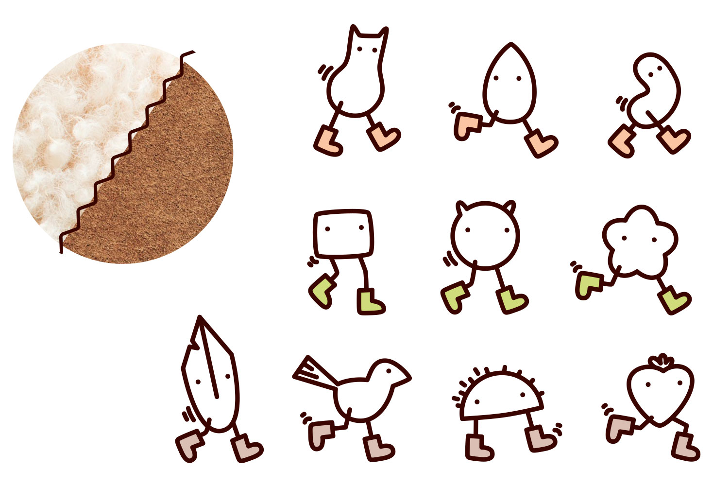
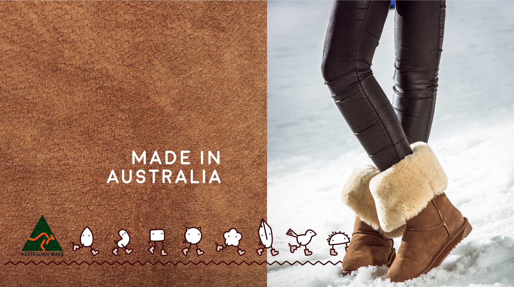
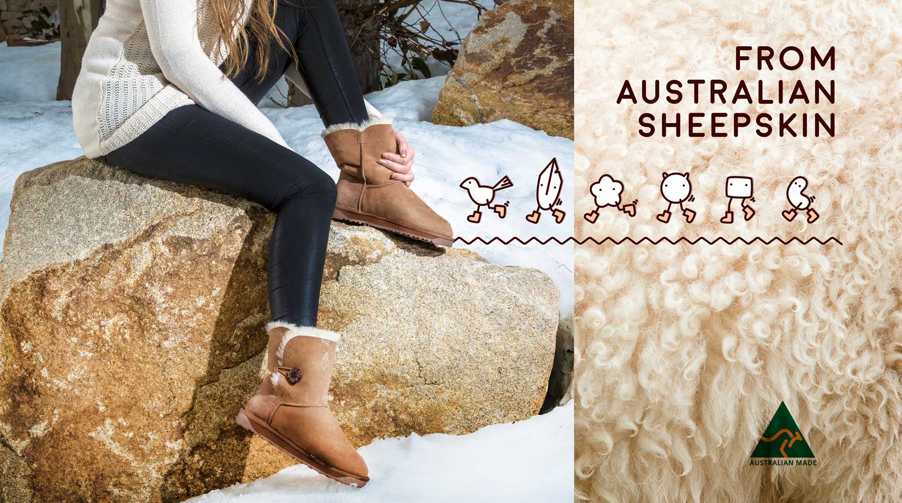
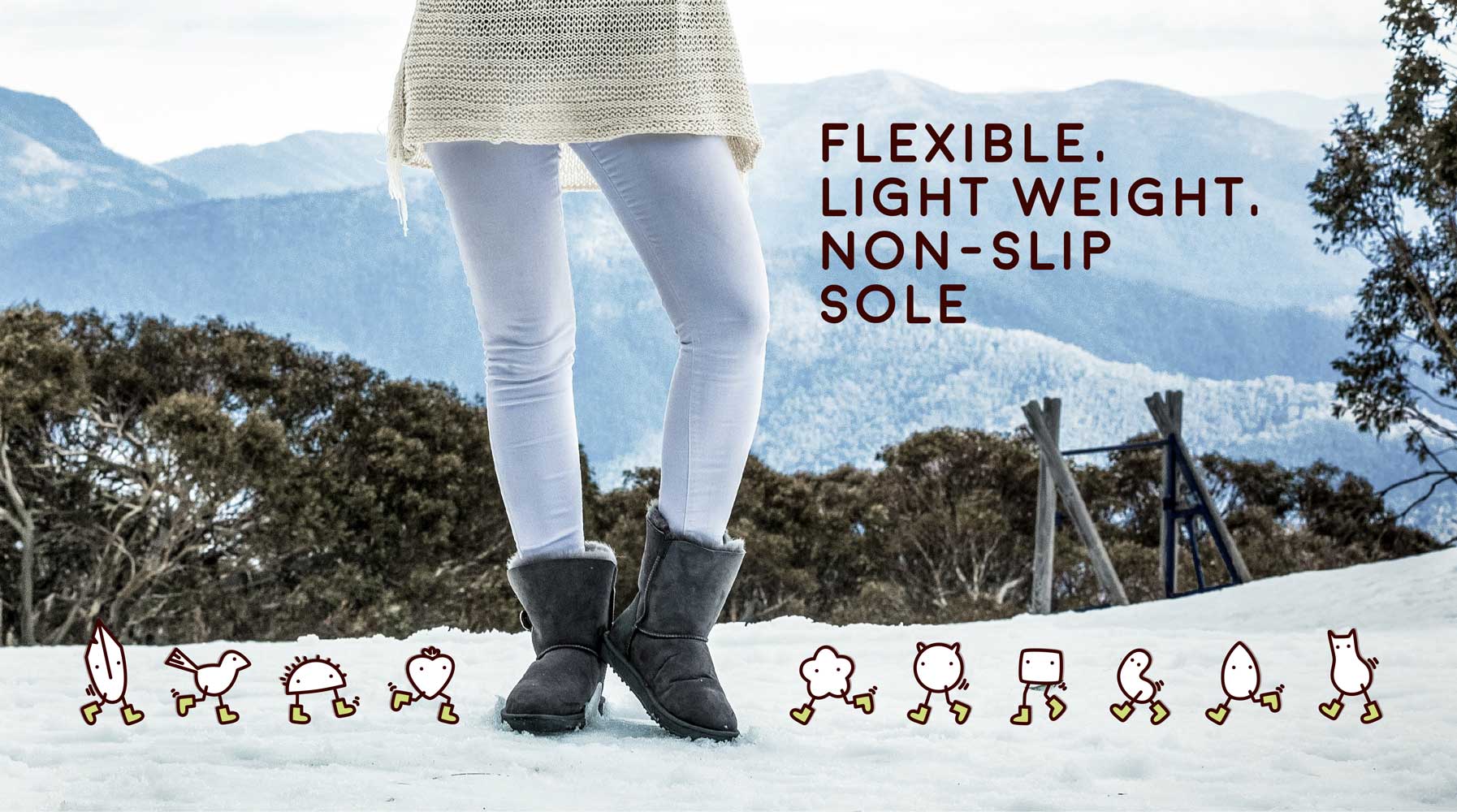
The sexiness and fun of the brand was injected entirely into the the little booty shaking critters. They’re dancing, they’re youthful and they’re friendly. The characters bring the fun – wearing and shaking their booty, intentionally ambiguous but with hints of natural elements like leaves, water drops, birds, cats, flowers, feathers & fruits. They represent lots of different types of feminine things and women, so individual ones are relatable to different personalities.
A zig zap stitch line element was also brought in to be an interesting junction – simulating the stitching on the boots, it brings through messages of both energy and fun, but also subtly conveys craftsmanship of the boots.
A set of promotional images of the product on models was also provided. These were all given a colour correction overhaul to fit better a suite with the textural image components of the brand. They were also re-cropped to simply focus on the lower part of the legs and remove anything else that might be distracted or date the images.
ClientBooty AustraliaSkillsBranding, illustration, photo editing, website design and buildYear2016
