Activated Wholefoods
Activated Wholefoods is an energetic premium organic brand that sells varieties of activated nuts. It’s super fun and active, it’s cheeky and damn it was fun making elements and collateral for!
“I will more than likely use brown kraft bags to begin but I want the labels to really bounce off the page with an ‘activated’ energy. I would like the brand to feel organic and wholesome but with a certain cheekiness and spunk just like its targeted customer.”
– – brief from this excellent client – –
BRANDING
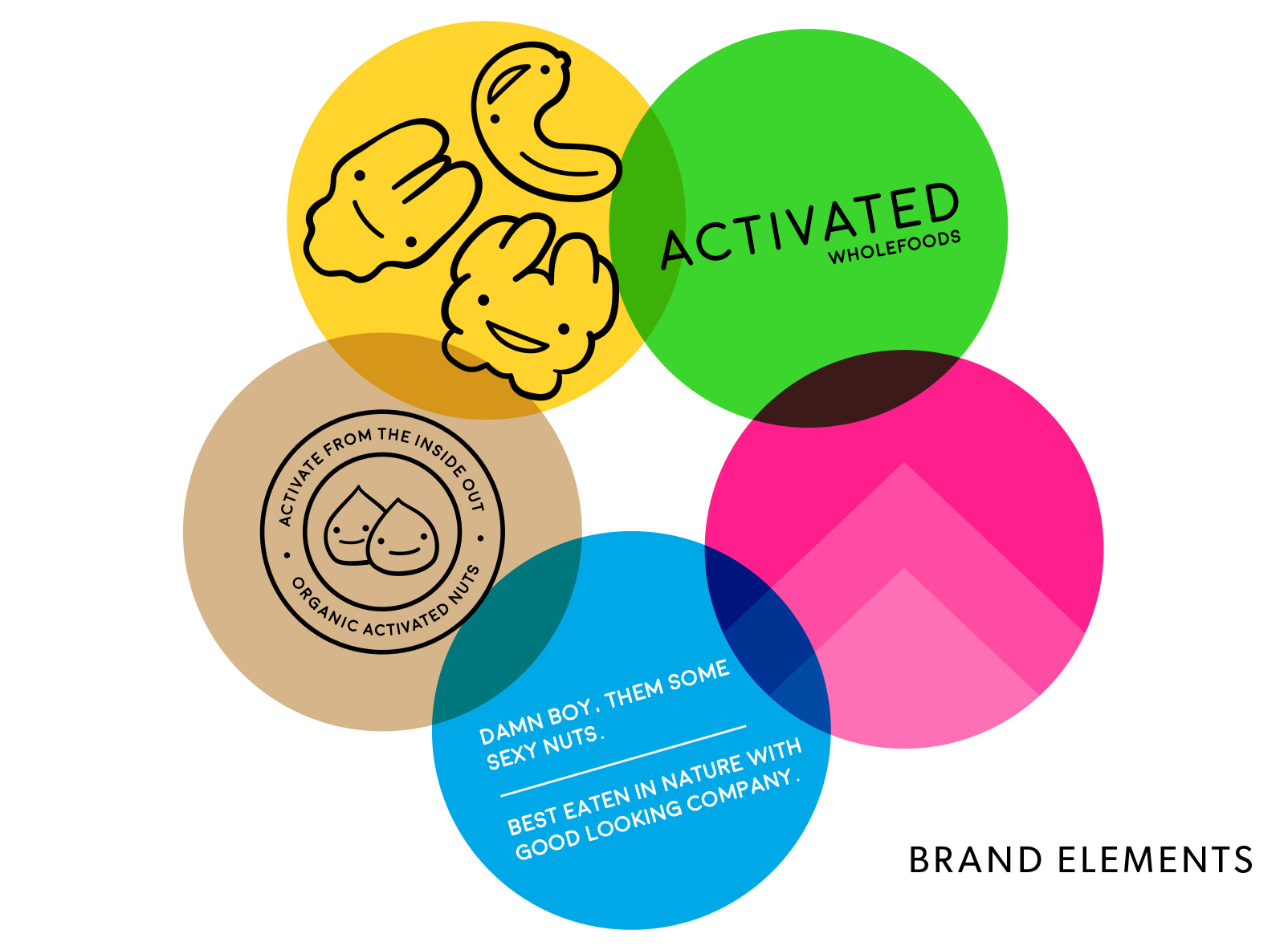
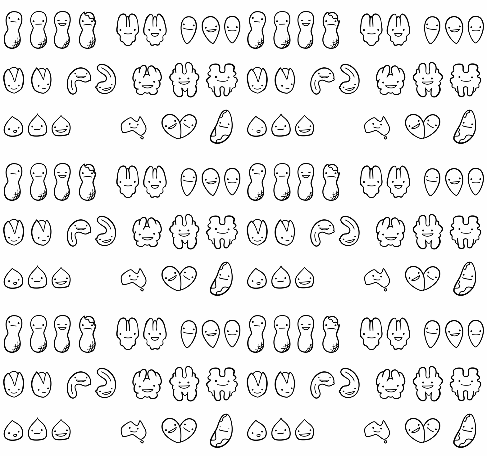
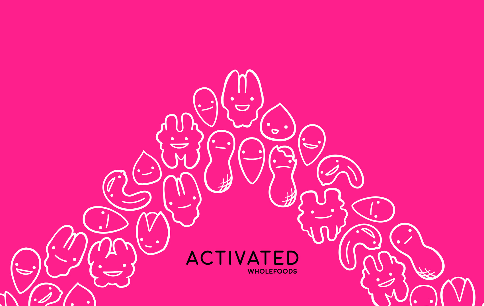
Energy and fun were the key characteristics of the brand, so a bright colour palette (something often shied away from in the health food area) and lots of fun and cheeky nut characters became integral to the brand. The Activated Wholefoods brand has many elements but the happy nuts are the ultimate focus. They’re happy, they’re cute, they’re bursting with energy. These little nut dudes are the core of happiness for the brand.
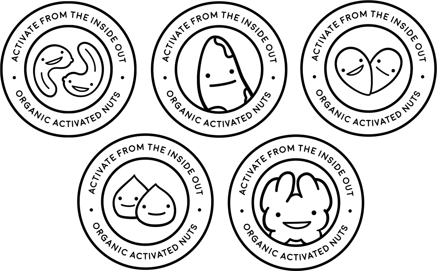
Other brand elements include the upward pointing chevron – which is the more literal interpretation of movement, energy and activation promoted by the brand. The rubber stamp of fun holds the brands tagline and feels like a fun sticker you collected when you were 8.
Cheeky language is also a key component of the brand. Nuts look kooky, they should probably talk a bit kooky too. It’s splashed out everywhere, it makes the brand endearing, like a good friend. Just another extra touch to make the brand stand out from the all the seriousness surrounding healthy food.
PACKAGING
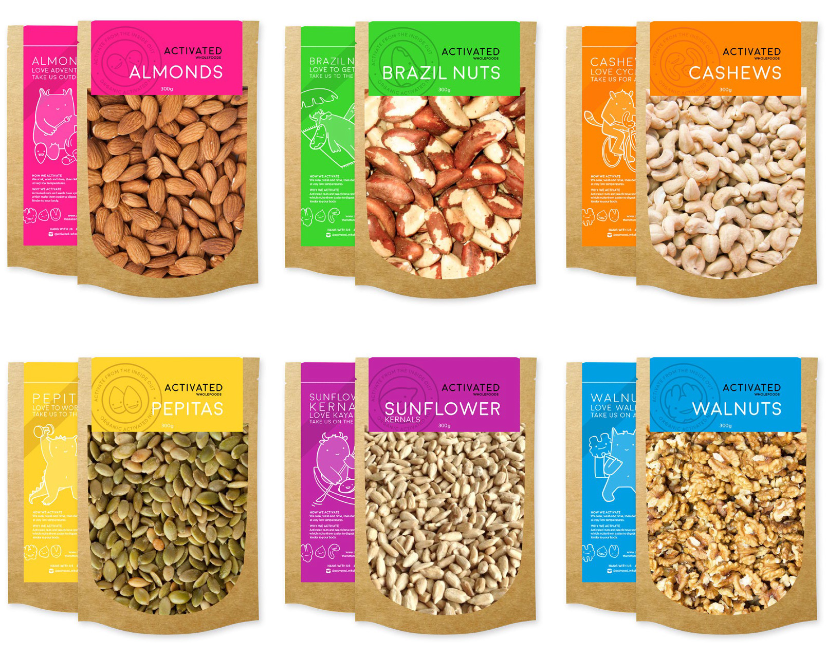
The client decided to use self standing bags which were clear on one side and kraft brown on the back, the nuts were the stars of the bag so we needed to let them shine.
A wrap around sticker was created to cover mostly the back of the bag and act as a security seal for the top too. Each nut got their own bright colour and rubber stamp of fun.
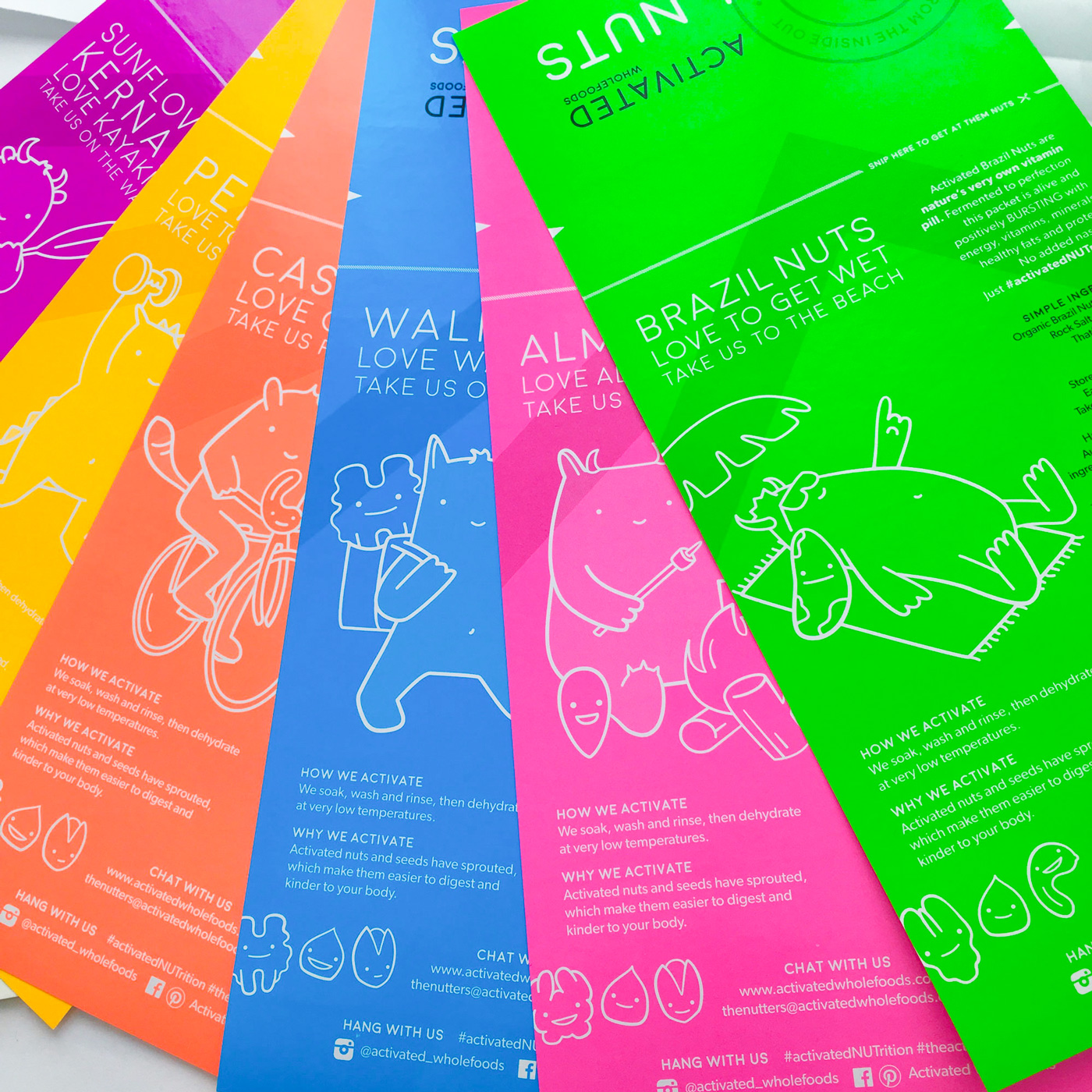
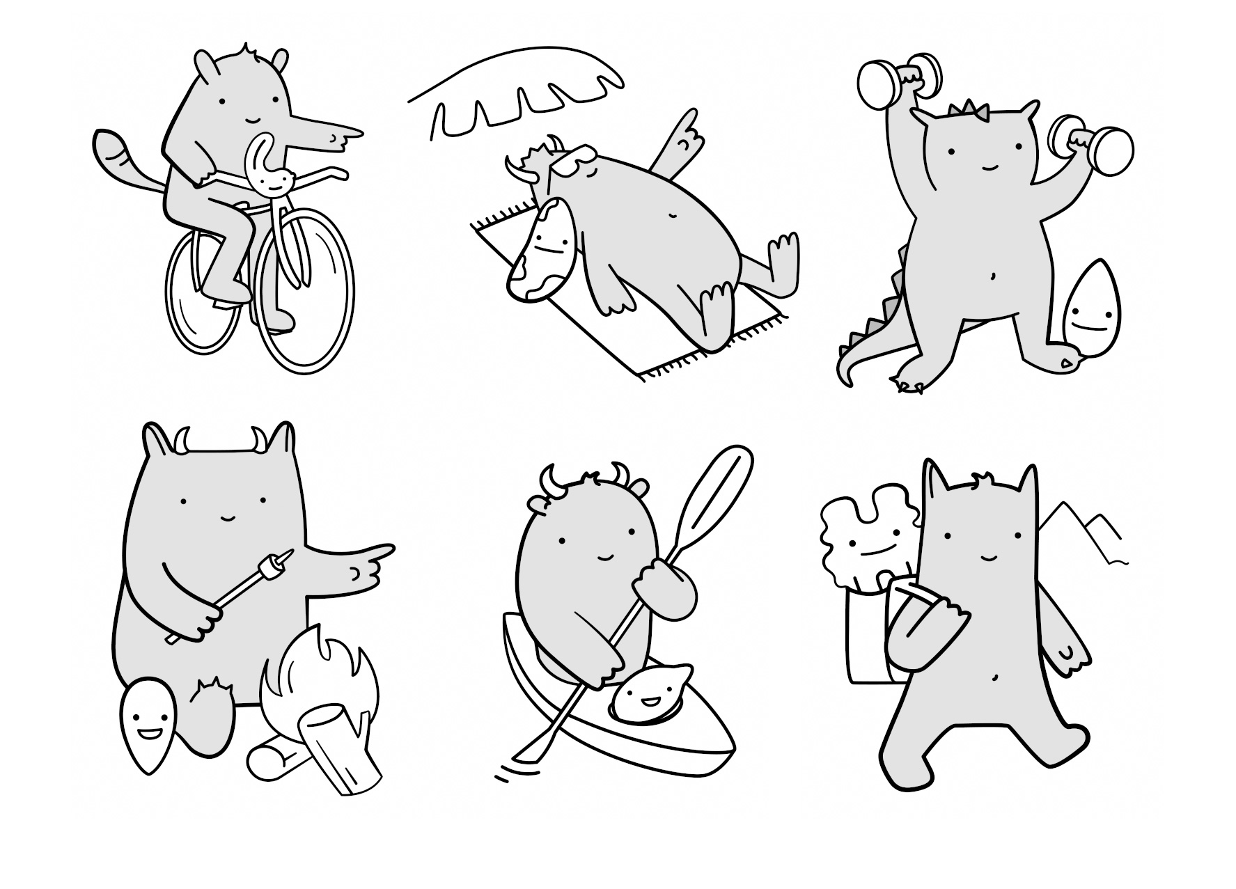
Together the client and I also came up with a concept of showing people doing active things with nuts – but we decided ultimately to use a cute squishy monster character instead of real person in the end.
All labels were printed 2 colour (fluro plus process black) on adhesive.
COLLATERAL
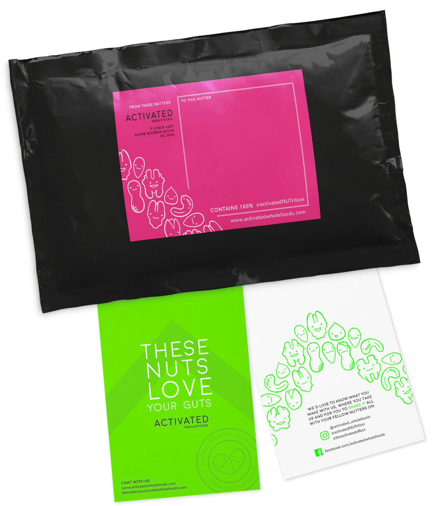
Brightly coloured stickers for addressing parcels from one Nutter to another and a postcard to include with orders, the brands same fun bright elements were carried through to the collateral with some cheeky language to match.
WEBSITE
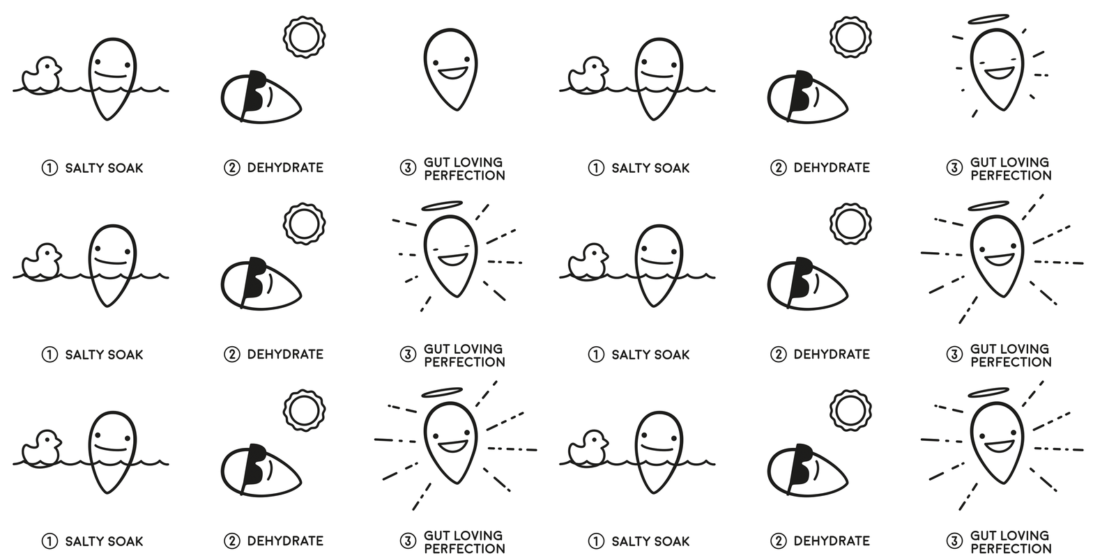
The Activated Wholefoods site isn’t currently active, but for it I created some fun gifs to explain what the product is – as in, what on earth is an activated nut? They were fun to make and I always get a thrill out of finding a way to explain something I originally didn’t understand :)
ClientActivated WholefoodsSkillsBranding, Illustration, Packaging, PrintYear2016
